The best contractor websites help a homeowner act quickly without making a rushed decision. They identify the trade and service area, show that the company is legitimate, and make it easy to call, book, or request an estimate.
This guide has two kinds of examples, kept apart on purpose. We benchmarked 259 websites across plumbing, HVAC, electrical, roofing, landscaping, and general contracting. Nine passed every requirement, and all nine are plumbing, heating, cooling, or electrical companies; the three benchmark winners below earned the highest overall scores. Because no remodeler, roofer, or home builder made that list, we added four design examples from those trades. They were not ranked; we reviewed each live homepage on a desktop and a phone on October 10, 2026.
All seven at a glance
| Website | Review | Focus | Idea to borrow | Main limitation |
|---|---|---|---|---|
| Local Plumbing and Drain Company | Benchmark winner #1, Aug 26, 2026 | Plumbing, Papillion, NE | Trade and city in the headline, phone and booking beneath it | Heavy hero media on weaker mobile connections |
| Brian Wear Plumbing & Restoration | Benchmark winner #2, Aug 26, 2026 | Plumbing and restoration, Columbia, MO | A memorable brand where the service request and phone stay loudest | The first screen favors recognition over local and licensing detail |
| The Plumbing & Air Service Co. | Benchmark winner #3, Aug 26, 2026 | HVAC, plumbing, and electrical, Greensboro and Winston-Salem, NC | Name each trade, then unify them around one promise | A crowded header to test on phones; the lowest authority score of the three winners |
| BOWA | Design example, Oct 10, 2026 | Remodeling, Virginia, Maryland, and DC | “What to expect” in the main navigation | No tap-to-call link on the first phone screen |
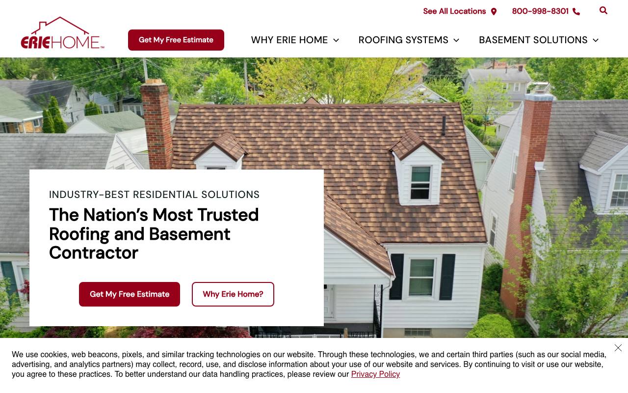
| Erie Home | Design example, Oct 10, 2026 | Roofing and basement waterproofing, many locations | A location finder in the top bar | An unsupported superlative headline; a cookie notice over the first screen |
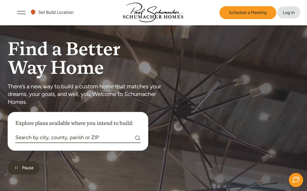
| Schumacher Homes | Design example, Oct 10, 2026 | Custom home building, many locations | A location lookup in the hero | A financing banner and cookie notice crowd the first phone screen |
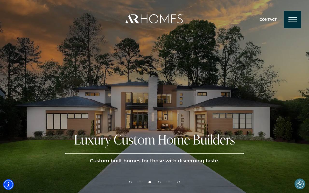
| AR Homes | Design example, Oct 10, 2026 | Luxury custom homes | One large photo of finished work, with the service named in the headline | A small text link is the only contact path; no phone number |
Each row carries the date of its evidence: the benchmark check for the winners, the live homepage review for the design examples. The design examples weren't scored.
What makes a contractor website work?
A strong home-service website answers practical questions fast:
- Do you provide the service I need? Main trades and emergency services should be easy to scan.
- Do you serve my address? Name the city or region and link to real service-area information.
- Can I trust your crew in my home? Show reviews, licenses, warranties, team information, and real local details.
- How do I get help? Keep the phone number and booking or estimate action obvious on mobile.
- What happens next? Set expectations for response time, scheduling, estimates, and emergency calls.
The strongest examples do this with different personalities: bold and local, friendly and memorable, or broad and professional.
The verified examples
1. Local Plumbing and Drain Company — bold local positioning
Official site: nebraskalocalplumbing.com
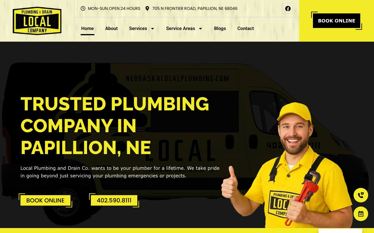
Local Plumbing and Drain Company makes its market impossible to miss. The first screen says “Trusted Plumbing Company in Papillion, NE,” backed by a branded service van, technician image, 24-hour availability, street address, phone number, and “Book Online” action.
The black-and-yellow identity is distinctive and fits the trade without looking like a generic template. It also carries consistently from the logo to the buttons and vehicle. That consistency matters for local recognition: a homeowner who has seen the truck or a local ad is likely to recognize the website immediately.
The word “trusted” is supported elsewhere by reviews, credentials, and complete business information. That separates a useful trust claim from empty marketing language. The page also offers both a direct call and online booking, which serves urgent customers as well as people searching after hours.
Best idea to borrow: Combine your primary trade and main service city in the headline, then place phone and booking options directly beneath it.
Opportunity: The hero is visually heavy. Compressing media and limiting third-party scripts could make the first view faster on weaker mobile connections.
Audit snapshot (August 26, 2026): Lab mobile performance 79/100. Routeless scores: search setup 100/100, trust 100/100, lead paths 100/100, AI readability 100/100. 450 referring websites (Ahrefs).
2. Brian Wear Plumbing & Restoration — a memorable phone-first brand
Official site: brianwearplumbing.com
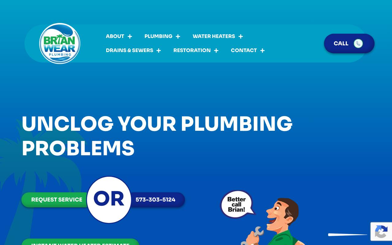
Brian Wear Plumbing uses bright color and a mascot to make a routine service company memorable. The headline “Unclog Your Plumbing Problems” is simple, while “Request Service” and the phone number are visually joined as the two main choices. The navigation is organized around homeowner tasks such as plumbing, water heaters, drains, sewers, and restoration.
Deeper page copy identifies Brian Wear as a licensed master plumber in Columbia, Missouri. Reviews, business information, and privacy details reinforce that local credibility. The site demonstrates that contractor branding can have personality while still keeping the transaction clear.
The first screen favors recognition over detail, so the supporting local and licensing information should remain close behind it. An online scheduling option could also capture visitors who arrive when the office is closed. That does not mean replacing the phone; it means giving customers another low-friction path.
Best idea to borrow: A memorable visual identity works best when the service request and phone number remain the loudest functional elements.
Audit snapshot (August 26, 2026): Lab mobile performance 93/100. Routeless scores: search setup 100/100, trust 100/100, lead paths 75/100, AI readability 100/100. 621 referring websites (Ahrefs).
3. The Plumbing & Air Service Co. — clear choices for a multi-trade company
Official site: plumbingserviceco.com
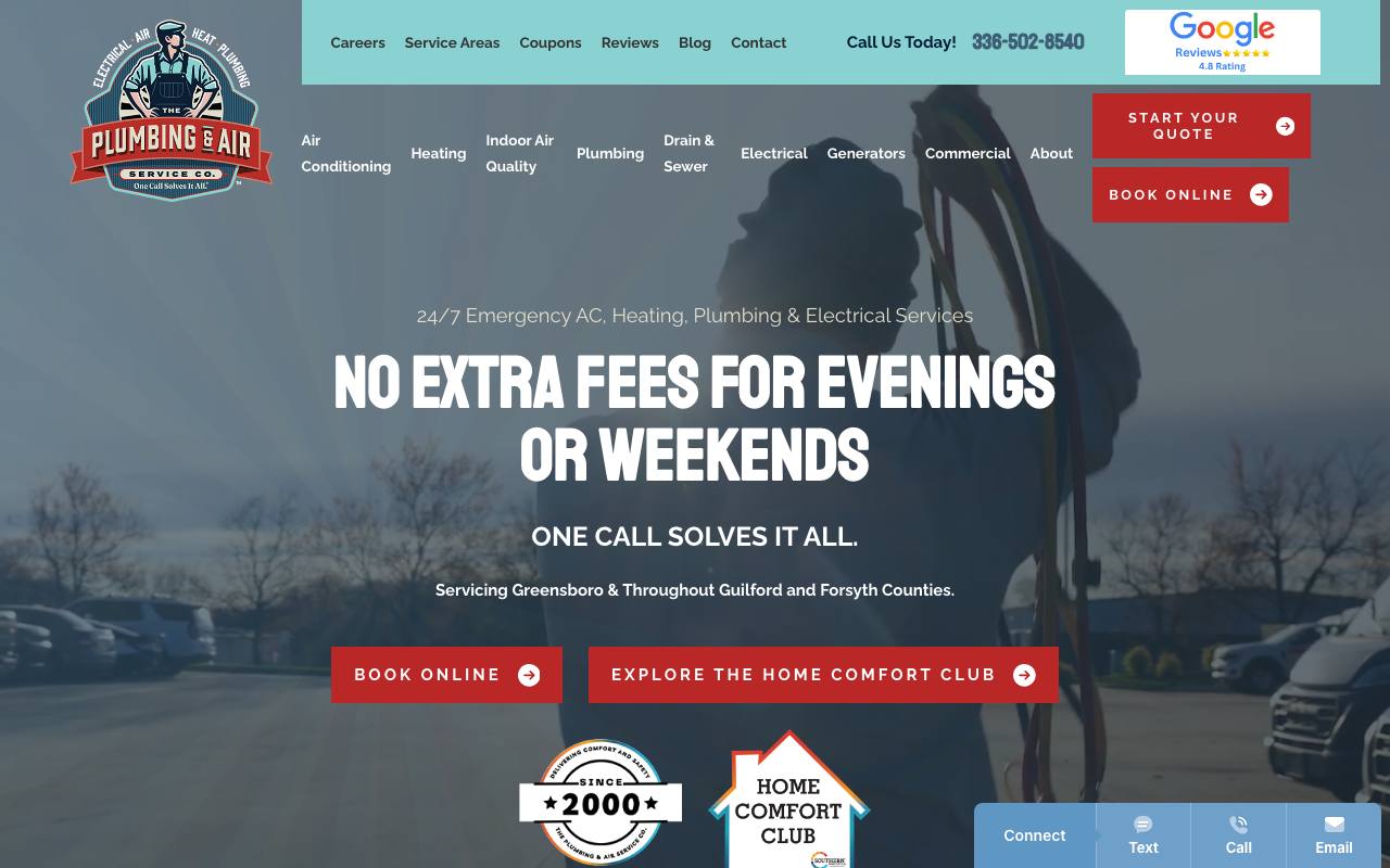
The Plumbing & Air Service Co. handles a common challenge: explaining several trades without turning the homepage into a directory. The header separates air conditioning, heating, indoor air quality, plumbing, drain and sewer, electrical, generators, and commercial work. The hero simplifies that range into a single homeowner benefit: no extra fees for evenings or weekends.
“Start Your Quote,” “Book Online,” and the phone number are all visible, while the service territory is stated underneath the headline. Reviews, credentials, company history, and real location information provide support for the offer. The site also performs well for real mobile users, despite covering more services than a single-trade contractor.
There are many choices in the header, so mobile navigation deserves careful testing. Each service should lead to a focused, useful page instead of repeating generic text. External authority is also the weakest part of this site’s score, leaving room for better local partnerships and project coverage.
Best idea to borrow: Multi-trade companies should name the major trades separately, then unify them around one clear customer promise.
Audit snapshot (August 26, 2026): Lab mobile performance 92/100. Real-user (field) speed: passing. Routeless scores: search setup 100/100, trust 100/100, lead paths 75/100, AI readability 100/100. 525 referring websites (Ahrefs).
Design examples from remodeling, roofing, and custom homes (reviewed October 10, 2026)
Planned projects sell differently from emergency repairs. A homeowner choosing a remodeler, roofer, or builder compares portfolios, process, and financing over weeks, so these sites lean on the work itself and on a consultation rather than a same-day call. They are not ranked and weren't benchmarked. Each review comes from the live homepage at desktop width and on a 390-pixel-wide phone.
BOWA — design-build remodeling organized around the buyer's questions
Official site: bowa.com · Focus: remodeling in Virginia, Maryland, and DC · Design-build remodeling
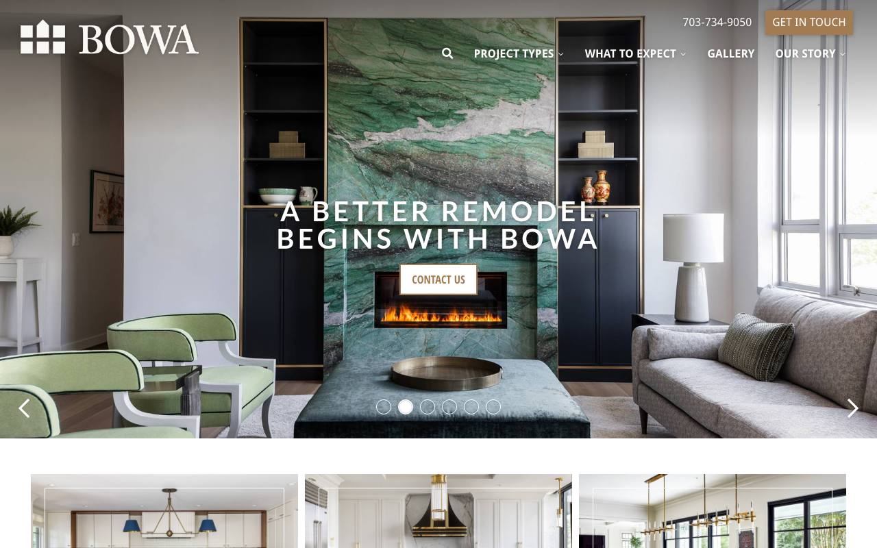
- Strength: The desktop header shows the phone number and a “Get in touch” button beside navigation built around what a remodeling client wants to know: Project types, What to expect, Gallery, and Our story.
- Strength: Finished rooms lead the page, followed by project-type tiles (kitchens, condominiums, and more), and on a phone a bottom bar keeps Projects, Gallery, and Contact one tap away.
- Limitation: The phone's first screen has “Get in touch” and “Contact us” buttons but no tap-to-call link, and the headline doesn't name the region it serves.
- Idea to borrow: Put “What to expect” in the main navigation when the process worries buyers as much as the price.
Erie Home — a roofing site that leads with the estimate
Official site: eriehome.com · Focus: roofing and basement waterproofing, many locations · Roofing
- Strength: On a phone, the phone number and a full-width “Get My Free Estimate” button come before anything else, and the desktop header repeats the estimate button next to the logo.
- Strength: The hero photo is the product—a finished shingle roof—and the navigation separates Roofing systems from Basement solutions, with “See all locations” in the top bar so visitors can confirm local service.
- Limitation: The headline calls the company “The Nation’s Most Trusted Roofing and Basement Contractor,” a superlative the first screen offers nothing to support, and a cookie notice covers the bottom of the first screen on both desktop and phone.
- Idea to borrow: A multi-branch contractor can put the location finder in the top bar instead of burying it in the footer.
Schumacher Homes — a custom builder that asks where you'll build
Official site: schumacherhomes.com · Focus: custom home building, many locations · Custom home builder
- Strength: The hero's main tool is a search—“Explore plans available where you intend to build,” by city, county, parish, or ZIP—which answers a custom-home buyer's first question: does this builder work where I want to build?
- Strength: The desktop header's main button is “Schedule a Meeting,” which suits a long, consultative purchase better than a quick-quote form; the phone header keeps a call icon.
- Limitation: When we captured the desktop page, the hero video was on a close-up of a light fixture rather than a home. On a phone, a financing banner and a cookie notice fill most of the first screen before the headline can be read.
- Idea to borrow: When service depends on the customer's location, put the location lookup in the hero.
AR Homes — finished-home photography carries a luxury position
Official site: arhomes.com · Focus: luxury custom homes · Luxury custom builder
- Strength: The headline names the service exactly—“Luxury Custom Home Builders”—over a full-width photo of a finished modern home at dusk.
- Strength: The first screen is restrained: one headline, one sentence, a photo carousel, and a small “Contact” link, which fits a high-end, appointment-led sale.
- Limitation: That small text link is the only contact path. Neither screen shows a phone number, the main navigation is behind a menu icon on desktop, and on a phone a privacy notice covers the lower part of the first screen, where the headline would be.
- Idea to borrow: For high-end work, let one large photo of a finished project carry the brand, with the service named plainly in the headline.
Contractor website ideas worth copying
Lead with service, location, and availability
“Quality you can trust” could describe any contractor. “24-hour plumbing in Papillion” tells a customer whether the company can solve the current problem. Use the first screen for concrete information, then support the message with brand personality.
Match the action to the urgency
Emergency and repair customers often want to call. Planned-project customers may prefer an estimate form or online appointment. Offer the right paths, label them clearly, and explain when someone will respond. A vague “Contact Us” button creates unnecessary work.
Use proof a homeowner can verify
Display the appropriate license, review source, warranty, years in business, service address, team photography, and recognizable affiliations. Avoid stock badges or unsupported “#1” claims. Project photos and specific customer stories are more persuasive than a wall of generic icons.
Build useful service-area pages
A strong city page explains what the company does in that market, shows nearby work, answers local questions, and links to the relevant services. Swapping city names in the same thin paragraph does not help homeowners and can weaken search quality.
Show the work
Before-and-after photos, project walkthroughs, and short case studies help customers understand workmanship. Label images with the service and location, get permission when needed, and explain the problem and result rather than publishing an unlabeled gallery.
A practical contractor homepage structure
- Header: logo, service area, phone number, and primary booking or estimate action.
- Hero: main trade, location, availability, one proof point, and two clear contact paths.
- Trust strip: review rating, license, warranty, or years in business.
- Core services: direct links organized around customer needs.
- Why choose the company: specific differentiators supported by evidence.
- Recent work: real projects with service and location context.
- Team or process: who arrives, how estimates work, and what happens next.
- Service area and final contact: cities served, address, hours, phone, and short form.
Our contractor website design guide covers the build in more detail. The contractor marketing guide explains how search, reviews, advertising, and follow-up fit around the website.
How we chose these examples
We combined the latest Routeless benchmark with broader public candidate discovery, then ran fresh checks on August 26, 2026. Each website had to represent an operating contractor, work securely on mobile, state real business information, provide a usable lead path, and remain accessible to search engines. We also checked external authority and whether search and AI systems can understand the content.
The minimum scores were 70 for mobile performance, 75 for SEO, 60 for trust, 50 for conversion, and 95 for AI readiness. Winners also needed structured data, a sitemap, a valid /llms.txt, a Domain Rating of at least 10, and at least 50 referring domains. Domain Rating, referring domains, and /llms.txt were recorded as context for the review, not as evidence that any of them causes rankings or AI recommendations. Passing establishes eligibility; it does not mean there is nothing left to improve.
The design examples were chosen differently. We looked for trades the nine qualified sites don't cover, captured each live homepage on October 10, 2026 at 1280 pixels wide, and opened it on a 390-pixel-wide phone to record what the first screen offers and whether it has a tap-to-call link. They weren't scored, so they can't be compared to the winners on speed or authority, and a place in this guide is not an endorsement.
Frequently asked questions
Why are only three contractor websites ranked?
Nine sites passed every requirement, and these three had the highest overall scores. All nine are plumbing, heating, cooling, or electrical companies, so the remodeling, roofing, and custom-home examples are shown separately as unranked design examples rather than mixed into the ranking.
What pages should a contractor website have?
Most need a homepage, one useful page for each major service, real service-area pages, an About or team page, reviews or case studies, financing and warranty information where relevant, contact and booking options, and complete business details.
What should appear above the fold?
Show the primary trade, service area, phone number, and booking or estimate action. One useful trust signal—such as a review rating, license, or availability promise—can support the decision without overcrowding the first screen.
Should a contractor show pricing online?
For variable jobs, explain service-call fees, estimate policies, financing, memberships, and the factors that affect price. Even a useful range or process is better than avoiding cost completely. If you are budgeting your own site, the contractor website cost guide covers what drives the price of a build.
How often are sites rechecked?
The benchmark is due for a recheck 120 days after it runs, and each recheck recaptures the homepages so the screenshots match the live sites. If a recheck is late, this page says so and dates the results instead of presenting them as current.
Contractor and home service websites built with Go
These demo websites came out of Routeless Go, which builds three designs from your business details and publishes the one you choose for $99 a month.

Cedar Ridge Builders
Home builder website in the clean and professional design.
Open the demo ↗Author: Eric Provencio · Reviewed: October 10, 2026
Methodology: Benchmark-scored review of 259 contractor websites; the published examples passed every stated requirement and use captured homepage screenshots.