The best med spa websites balance beauty with medical credibility. They help a visitor explore treatments without feeling overwhelmed, show who provides the care, and make it easy to book a consultation.
We reviewed 110 med spa and aesthetics websites. Only three passed every requirement. That is a small list, but it is more useful than a long gallery of attractive homepages with weak provider information, poor mobile performance, or broken booking paths.
The three at a glance
| Website | Review | Focus | Idea to borrow | Main limitation |
|---|---|---|---|---|
| Mirabile M.D. | Benchmark winner #1, Aug 26, 2026 | Med spa and women’s health, Overland Park, KS | Real provider photography and a stated philosophy of care | Passed the speed minimum narrowly; prompts can appear early |
| MedSpa at Seena One | Benchmark winner #2, Aug 26, 2026 | Med spa, Burleson and Fort Worth, TX | Lead with the care model when it is a real differentiator | No guided first step for visitors who haven't chosen a treatment |
| Ageless Remedies | Benchmark winner #3, Aug 26, 2026 | Med spa and laser center, Charlotte, NC | An emotional headline paired with a plain service-and-location line | Location and providers could be clearer; Domain Rating at the benchmark minimum |
What makes a med spa website effective?
The strongest med spa websites share several traits:
- The positioning is specific. Visitors can tell whether the practice focuses on injectables, skin, body treatments, wellness, or a broader medical-aesthetics program.
- Providers are visible. Names, photographs, medical credentials, and treatment responsibilities are easy to find.
- Treatment discovery is simple. People can browse by concern as well as by procedure.
- Results are presented responsibly. Before-and-after imagery has context, permission, and realistic expectations.
- Booking does not overpower the page. Consultation options remain visible without popups covering the content.
Luxury photography can help establish a brand, but it cannot compensate for vague writing or hidden medical proof.
The verified examples
1. Mirabile M.D. — a personal, physician-led first impression
Official site: mirabilemd.com
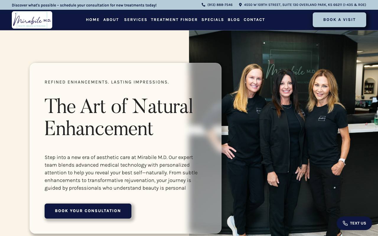
Mirabile’s homepage opens with real members of the care team rather than a generic beauty image. The warm neutral palette and editorial typography create a premium feel, while the line “The Art of Natural Enhancement” clearly states the desired outcome. A short paragraph explains that the practice blends medical technology with personalized attention, and a single consultation button provides the next step.
The site goes beyond the first impression with named providers, medical credentials, reviews, location details, and several ways to contact or book. That complete path earned full marks in our trust and conversion checks. The real-team photography is especially effective because it makes a medical service feel both credible and personal.
The weakness is speed. Mirabile passed our minimum, but only narrowly. The page also uses appointment and messaging prompts that can compete with the underlying content if they appear too early. The visual experience would be stronger if it arrived faster and let visitors orient themselves before opening a prompt.
Best idea to borrow: Use real provider photography and a specific philosophy of care to create warmth without losing medical credibility.
Audit snapshot (August 26, 2026): Lab mobile performance 71/100. Routeless scores: search setup 100/100, trust 100/100, booking paths 100/100, AI readability 100/100. 592 referring websites (Ahrefs).
2. MedSpa at Seena One — medical positioning before beauty language
Official site: medspaatseenaone.com
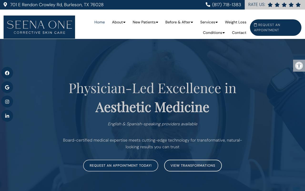
Seena One leads with “Physician-Led Excellence in Aesthetic Medicine.” That phrase does useful work: it identifies the medical model and differentiates the practice from non-medical beauty services. The header displays the address, phone number, rating, and appointment action, while the navigation lets visitors browse services, concerns, before-and-after results, and information for new patients.
The blue palette feels calm and clinical without becoming cold. English- and Spanish-speaking provider availability appears directly under the headline, adding a meaningful access detail rather than a generic marketing claim. The broader site supports this message with provider credentials, reviews, and complete location information.
Seena One has the best combination of mobile speed and external authority in the group. Its main opportunity is the first step for undecided visitors. A short consultation form or “help me choose” path could serve someone who understands a concern but does not yet know the treatment name.
Best idea to borrow: Lead with the care model—such as physician-led treatment—when it is a real differentiator, then support it with visible provider proof.
Audit snapshot (August 26, 2026): Lab mobile performance 92/100. Routeless scores: search setup 100/100, trust 100/100, booking paths 75/100, AI readability 100/100. 659 referring websites (Ahrefs).
3. Ageless Remedies — a simple luxury message with clear local relevance
Official site: agelessremedies.com
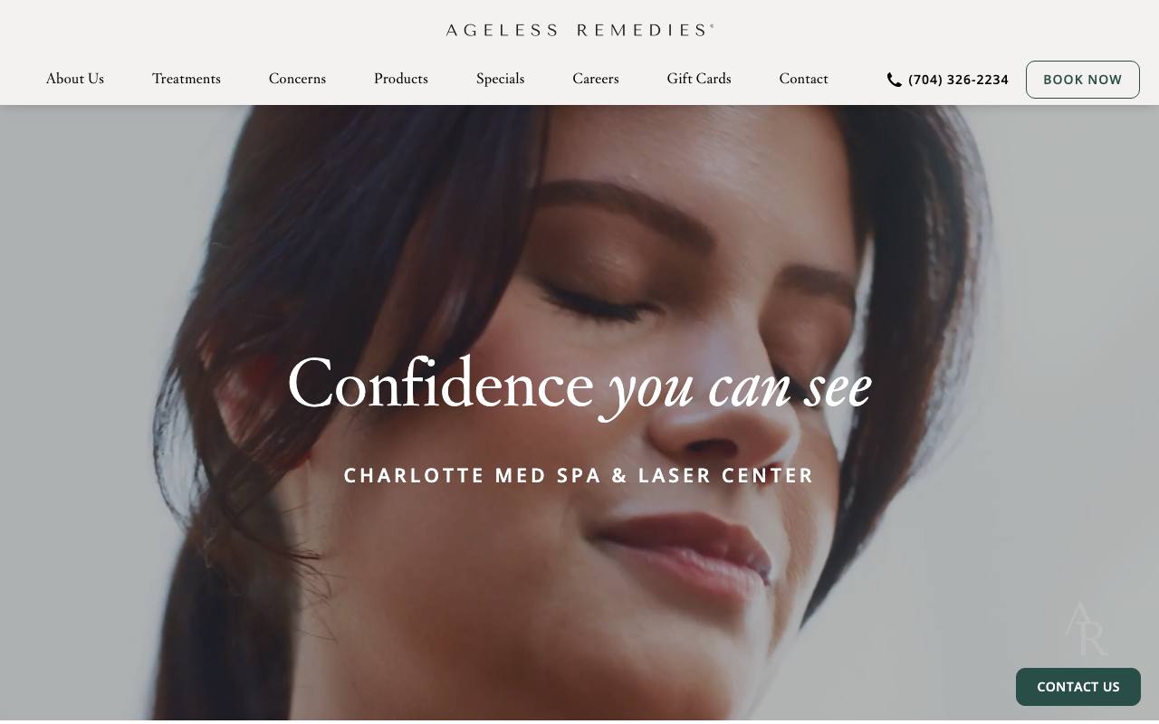
Ageless Remedies takes the most minimal approach. The full-width portrait, refined wordmark, and line “Confidence you can see” create an upscale first impression. “Charlotte Med Spa & Laser Center” immediately grounds that message in a service and market, while the header keeps treatments, concerns, a phone number, and “Book Now” within reach.
This is a good example of using a short emotional headline responsibly. The supporting local phrase prevents the hero from becoming vague, and the treatment navigation helps visitors move from inspiration to information. Reviews, credentials, privacy information, and booking options provide the functional layer behind the polished presentation.
The homepage could expose the physical location and providers more clearly. Its Domain Rating also sits at our minimum, so local press, partnerships, and genuinely useful treatment resources should be a priority. The design looks established; the external authority should catch up.
Best idea to borrow: Pair an emotional brand message with a plain service-and-location line. A visitor should never have to choose between beauty and clarity.
Audit snapshot (August 26, 2026): Lab mobile performance 73/100. Routeless scores: search setup 100/100, trust 80/100, booking paths 75/100, AI readability 100/100. 582 referring websites (Ahrefs).
Med spa website ideas worth copying
Let visitors browse by concern
New patients may know they want help with acne scars, sun damage, unwanted hair, volume loss, or body contouring without knowing a branded treatment name. Organize navigation around both concerns and procedures, then explain how a consultation determines suitability.
Put medical proof near treatment claims
Show who performs each procedure, the provider’s credentials, and the level of supervision. Avoid implying that every service is performed by a physician when that is not the case. Clear provider responsibility builds trust and helps patients make informed choices.
Use real photography carefully
Team, office, and treatment photography can make the practice tangible. Before-and-after galleries should identify the procedure, timeline, and relevant context without promising identical results. Consistent lighting and framing are more useful than dramatic editing.
Explain the consultation
“Book now” can feel premature for a person who has not chosen a treatment. Explain whether the first appointment is virtual or in person, whether there is a fee, how long it takes, what the provider will assess, and whether treatment can happen the same day.
Keep overlays under control
Text, chat, appointment prompts, discount offers, and cookie notices often compete for the first screen. Use one primary booking action and let visitors see the practice before asking them to dismiss several boxes.
A practical med spa homepage structure
- Header: practice name, phone, location, treatment navigation, and booking action.
- Hero: specific positioning, real visual identity, short supporting explanation, and one next step.
- Medical trust: provider names, credentials, supervision model, and review evidence.
- Browse by concern: plain-language paths for visitors who do not know procedure names.
- Popular treatments: concise explanations with candidacy and provider links.
- Results and stories: responsibly presented before-and-after examples and patient experiences.
- Consultation process: what happens, what it costs, and how to prepare.
- Location and final booking: address, hours, map, phone, and consultation option.
See our med spa marketing guide for the acquisition system around these pages. The med spa website cost guide covers realistic redesign budgets and priorities.
How we chose these examples
We combined the latest Routeless healthcare benchmark with broader public discovery and performed fresh checks on August 26, 2026. Every winner had to represent an operating medical-aesthetics practice, work securely on mobile, provide medical and location trust signals, offer a booking path, and remain accessible to search engines. We also checked external authority and whether search and AI systems can understand the site.
The minimum scores were 70 for mobile performance, 75 for SEO, 60 for trust, 50 for conversion, and 95 for AI readiness. Winners also needed structured data, a sitemap, a valid /llms.txt, a Domain Rating of at least 10, and at least 50 referring domains. Domain Rating, referring domains, and /llms.txt were recorded as context for the review, not as evidence that any of them causes rankings or AI recommendations.
These are eligibility floors, not claims of perfection. Mirabile and Ageless Remedies, for example, passed the speed requirement but still have clear performance opportunities.
Frequently asked questions
Why are there only three examples?
Only three of 110 candidates passed every requirement. We chose not to pad the article with visually attractive sites that failed important trust, mobile, booking, or search checks.
What pages should a med spa website include?
Most practices need a homepage, concern and treatment pages, complete provider profiles, consultation information, before-and-after results, pricing or financing guidance, policies, location details, and simple contact and booking paths.
Should a med spa publish treatment prices?
When possible, publish a starting price or realistic range and explain what changes the final cost. If pricing truly depends on consultation, explain the consultation fee, financing, memberships, and when a patient receives a quote.
Does passing mean every metric is perfect?
No. The scores are minimum eligibility requirements. Each review above names an improvement instead of pretending the winners are flawless.
How often are med spa winners reviewed?
The benchmark is due for a recheck 120 days after it runs, and each recheck recaptures the homepages and confirms every winner still meets the published requirements. If a recheck is late, this page says so and dates the results instead of presenting them as current.
Med spa and healthcare websites built with Go
These demo websites came out of Routeless Go, which builds three designs from your business details and publishes the one you choose for $99 a month.

Solace Aesthetics
Med spa website in the modern and minimal design.
Open the demo ↗Author: Eric Provencio · Reviewed: October 10, 2026