Most lists of the best dental websites judge a screenshot. We wanted to know whether the sites work for actual patients. Can someone tell where the practice is, understand what it offers, trust the dentists, and book without hunting?
We reviewed 254 dental websites and found 18 that passed every check. The three below earned the highest overall scores. Each combines a clear first impression with the less visible work that helps a website load quickly, appear in search, and turn visits into appointments.
What the best dental websites get right
The strongest dental websites answer four questions almost immediately:
- Am I in the right place? The city, service area, and type of dental care are obvious.
- Can I trust this practice? Reviews, dentist credentials, real office information, and patient-friendly language are easy to find.
- What should I do next? Calling and booking online are both visible, especially on a phone.
- Will the site make this harder than it needs to be? Pages load reliably, stay readable, and do not jump around while a patient is trying to tap something.
The visual style can vary. One practice may feel premium, another friendly, and another highly convenient. Clarity is the common thread.
The verified examples
1. AVF Dental Group — premium design with immediate proof
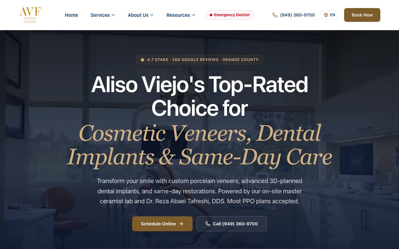
AVF opens with a confident promise, names Aliso Viejo, and highlights its most valuable services: cosmetic veneers, dental implants, and same-day care. The dark photography and gold type create a premium feel without hiding the practical information a patient needs. A review count sits above the headline, while “Schedule Online” and the phone number offer two clear next steps.
That order matters. A cosmetic or implant patient is likely comparing practices, so AVF gives them reputation, relevance, and convenience in the first screen. The copy also explains why the care is different—an on-site master ceramist lab and 3D-planned implants—instead of relying on generic claims such as “state-of-the-art dentistry.”
Best idea to borrow: Put a specific proof point directly above the main headline, then pair online scheduling with a visible phone option.
Opportunity: AVF’s external authority is the weakest part of an otherwise excellent website. More useful local resources, professional citations, and earned links could strengthen its reach.
Audit snapshot: Mobile speed 93/100, search setup 100/100, trust 100/100, appointment paths 75/100, AI readability 100/100, and 583 referring websites. The site passed every required check.
2. Konikoff Dental Associates — a friendly system for multiple locations
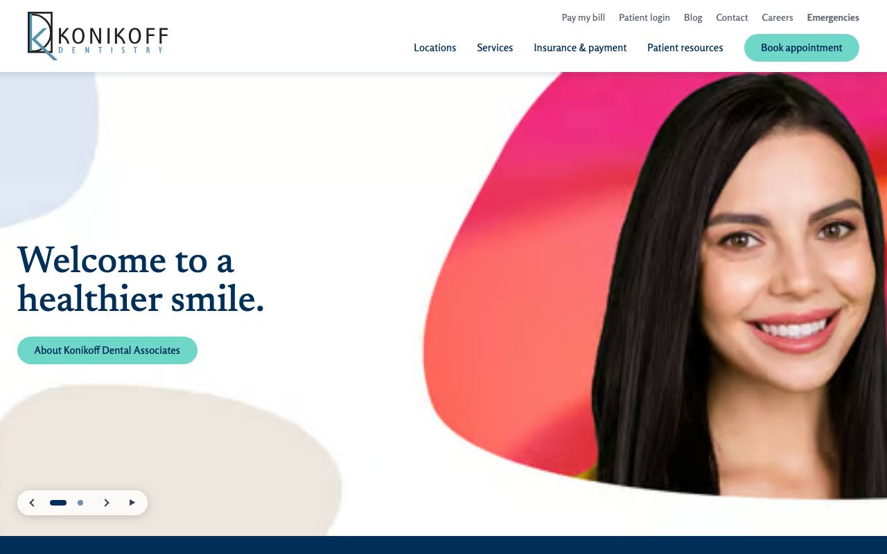
Konikoff Dental Associates uses a lighter, more approachable style. The generous white space, teal appointment button, and welcoming portrait feel less clinical than many large dental-group websites. The navigation gives “Locations,” “Services,” and “Insurance & payment” top billing, which matches the questions a new patient is most likely to ask.
This is also the fastest website in the group. That is especially valuable for a multi-location practice, where extra office pages, tracking tools, and scheduling integrations can easily make the experience sluggish. Konikoff keeps the brand consistent while making it simple to move from the group homepage to the right office.
The hero message—“Welcome to a healthier smile”—is warm but broad. More location or service detail in that message could improve it further. Even so, the persistent “Book appointment” action means a ready patient never needs to search for the next step.
Best idea to borrow: Organize the main navigation around patient decisions, not the practice’s internal departments.
Opportunity: Show dentist credentials or a direct path to provider profiles closer to the top of the homepage.
Audit snapshot: Mobile speed 99/100, search setup 100/100, trust 80/100, appointment paths 75/100, AI readability 100/100, and 706 referring websites.
3. Dental One Associates of Maryland — location finding as the main action
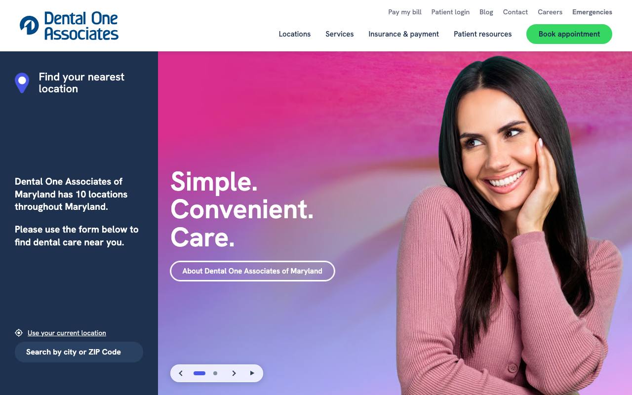
Dental One makes a smart choice for a ten-office group: it turns location finding into the main homepage task. The first screen invites patients to search by city or ZIP code instead of forcing them through a generic corporate introduction. The headline, “Simple. Convenient. Care.” reinforces that convenience-focused position.
The colorful design feels consumer-friendly, and the “Book appointment” button remains easy to spot in the header. Behind the homepage, separate location paths help patients find the nearest office and help search engines understand where the group actually provides care. This is a better model than putting every city in one long page and expecting visitors to sort it out themselves.
Dental One also has the strongest domain authority of these three winners. That suggests the location structure is supported by a broader web presence rather than existing only as a design feature.
Best idea to borrow: If you have several offices, make location selection part of the primary journey—not a small link in the footer.
Opportunity: Add more visible dentist and care-team proof before asking a new patient to book.
Audit snapshot: Mobile speed 94/100, search setup 100/100, trust 80/100, appointment paths 75/100, AI readability 100/100, and 605 referring websites.
See what your new website could look like.
Get 3 free designs for your business. Choose your favorite.
Dental website design ideas worth copying
Make the first screen useful
A patient should see the practice name, location, type of care, and next action without scrolling. A beautiful hero that only says “Love your smile” wastes the most valuable space on the page. AVF is the strongest example here because it combines emotional appeal with named treatments and local proof.
Offer more than one appointment path
Some patients want to call. Others are browsing after hours and expect online scheduling. Show both when possible. On mobile, keep the actions large enough to tap and avoid covering the page with competing chat, text, and booking widgets.
Build a page for each real service and location
Patients search for specific needs: emergency dentist, dental implants, Invisalign, pediatric care, or a dentist near a particular city. A useful page should explain the treatment, identify who provides it, answer common questions, and lead to the correct office. Thin pages that simply swap city names are not helpful.
Put reassurance near the decision
Insurance information, patient reviews, dentist bios, financing, and office photos reduce uncertainty. Do not make patients visit five pages to decide whether the practice feels legitimate. Place the most relevant proof near appointment buttons and forms.
Keep the writing human
Patients usually do not need a lecture on clinical terminology. Explain the problem, what the visit is like, who provides the care, and what happens next. Plain language improves accessibility and also gives search engines clearer answers to match with real questions.
A practical homepage blueprint for a dental practice
You do not need to copy the visual style of any winner. Copy the order in which they answer questions:
- Header: practice name, phone number, and book-online button.
- Hero: city, primary type of care, one meaningful proof point, and a clear action.
- Trust strip: review rating, years in practice, memberships, or another verifiable credential.
- Services: direct links to the treatments patients search for most.
- Dentists: real photos, names, qualifications, and a short reason to trust the team.
- Patient guidance: insurance, financing, first-visit expectations, and emergency instructions.
- Reviews and results: specific patient stories or ethically presented case examples.
- Location and final action: address, hours, map, phone, and booking form.
For a deeper build guide, see our dental website design checklist. If organic visibility is the main problem, start with the dental SEO guide.
How we chose these examples
We began with the latest Routeless benchmark and checked every candidate again on August 26, 2026. A website had to represent an operating dental practice, load securely, work on mobile, be available to search engines, and provide basic trust and appointment information. We also checked external authority—whether other websites link to the domain—and whether the content can be understood by modern search and AI systems.
For transparency, the minimum scores were 70 for mobile performance, 75 for SEO, 60 for trust, 50 for conversion, and 95 for AI readiness. Each site also needed a Domain Rating of at least 10, at least 50 referring domains, structured data, a sitemap, and a valid /llms.txt file. Domain Rating, referring domains, and /llms.txt were recorded as context for the review, not as evidence that any of them causes rankings or AI recommendations. A passing result is not a claim that the site is perfect; our notes still identify what we would improve.
Results are due for a recheck 120 days after they are measured. If the recheck is late, this page says so and dates the results instead of presenting them as current.
Frequently asked questions
What makes a dental website eligible for this list?
It must be a real operating practice, work reliably on mobile, clearly establish trust, offer an appointment path, and meet our search and authority requirements. A polished design alone is not enough.
What pages should every dental website have?
At minimum: a useful homepage, individual service pages, dentist bios, location and contact information, patient forms or first-visit guidance, insurance and financing information, privacy information, and an easy booking path. Multi-location groups should also have a complete page for each office.
Should a dentist show prices online?
Exact treatment prices are not always possible, but the website should explain insurance, financing, consultation fees, and the factors that affect cost. That is more useful than avoiding the subject entirely.
Why require llms.txt?
For this benchmark, /llms.txt is a simple directory that points AI systems toward the practice’s important content. We record it because it shows the practice has thought about how AI systems read the site. It does not replace good writing, normal SEO, or structured data, and we have no evidence that it changes rankings on its own.
How often are winners checked?
At least every 120 days. We also recapture each homepage so the example shown here still represents the live site.
Dental and healthcare websites built with Go
These demo websites came out of Routeless Go, which builds three designs from your business details and publishes the one you choose for $99 a month.

Brightside Family Dental
Dental practice website in the clean and professional design.
Open the demo ↗Author: Eric Provencio · Reviewed: August 26, 2026