The best law firm websites make a difficult moment feel easier. They tell a potential client, in plain language, what the firm handles, where it works, why its attorneys are credible, and how to get help.
This guide has two kinds of examples, kept apart on purpose. The three benchmark winners scored highest of 255 law firm websites on our checks for mobile usability, trust, consultation paths, search visibility, and external authority, and we inspected their live homepages so a high score could not excuse an empty, broken, or intrusive first impression. The four design examples were not ranked. We picked them on October 10, 2026 because they show approaches the winners don't—a founder-led small firm, a single-practice boutique, a modern family-law brand, and a minimal litigation site—and we reviewed each one's live homepage on a desktop and a phone.
All seven at a glance
| Website | Review | Focus | Idea to borrow | Main limitation |
|---|---|---|---|---|
| Malloy Law Offices | Benchmark winner #1, Aug 26, 2026 | Personal injury | One message, one consultation button, one visible phone number | Large hero media can slow the first view on a phone |
| Sahn Law Firm | Benchmark winner #2, Aug 26, 2026 | Criminal defense, Charleston, SC | Practice area and city in the visible headline | Traditional styling; the navigation could be simpler |
| HagEstad Law Group | Benchmark winner #3, Aug 26, 2026 | Business, estate, litigation, and real estate law, MT and AZ | Route visitors by state before the contact form | A broad service list without a clear path for each kind of client |
| Collins Law | Design example, Oct 10, 2026 | Personal injury, Birmingham, AL | A full-width call bar under the logo on phones | The headline doesn't name the practice or city |
| Gerben IP | Design example, Oct 10, 2026 | Trademark law, nationwide | Name the main button after the service | No phone number on desktop or phone |
| Modern Family Law | Design example, Oct 10, 2026 | Divorce and family law | Name the family situations the firm handles | No call or consultation link on the first phone screen |
| Susman Godfrey | Design example, Oct 10, 2026 | Trial litigation | One sentence that names the client's situation | No contact path on the first screen |
Each row carries the date of its evidence: the benchmark check for the winners, the live homepage review for the design examples. The design examples weren't ranked against the winners.
What makes a law firm website effective?
A strong attorney website should do five things:
- Name the problem it solves. “Criminal defense in Charleston” is more useful than “Justice when you need it.”
- Show who will handle the matter. Attorney names, photographs, credentials, and relevant experience reduce uncertainty.
- Prove important claims. Reviews, case outcomes, professional recognition, and real office details are stronger than unsupported superlatives.
- Make contact feel safe and simple. A visible phone number and short consultation path should work well on mobile.
- Set expectations. Helpful service pages explain who the firm serves, what may happen next, and when someone should call.
Design style matters, but clarity matters more. These three firms take different visual approaches while keeping the client’s decision at the center.
The verified examples
1. Malloy Law Offices — a strong promise with a clear next step
Official site: malloy-law.com
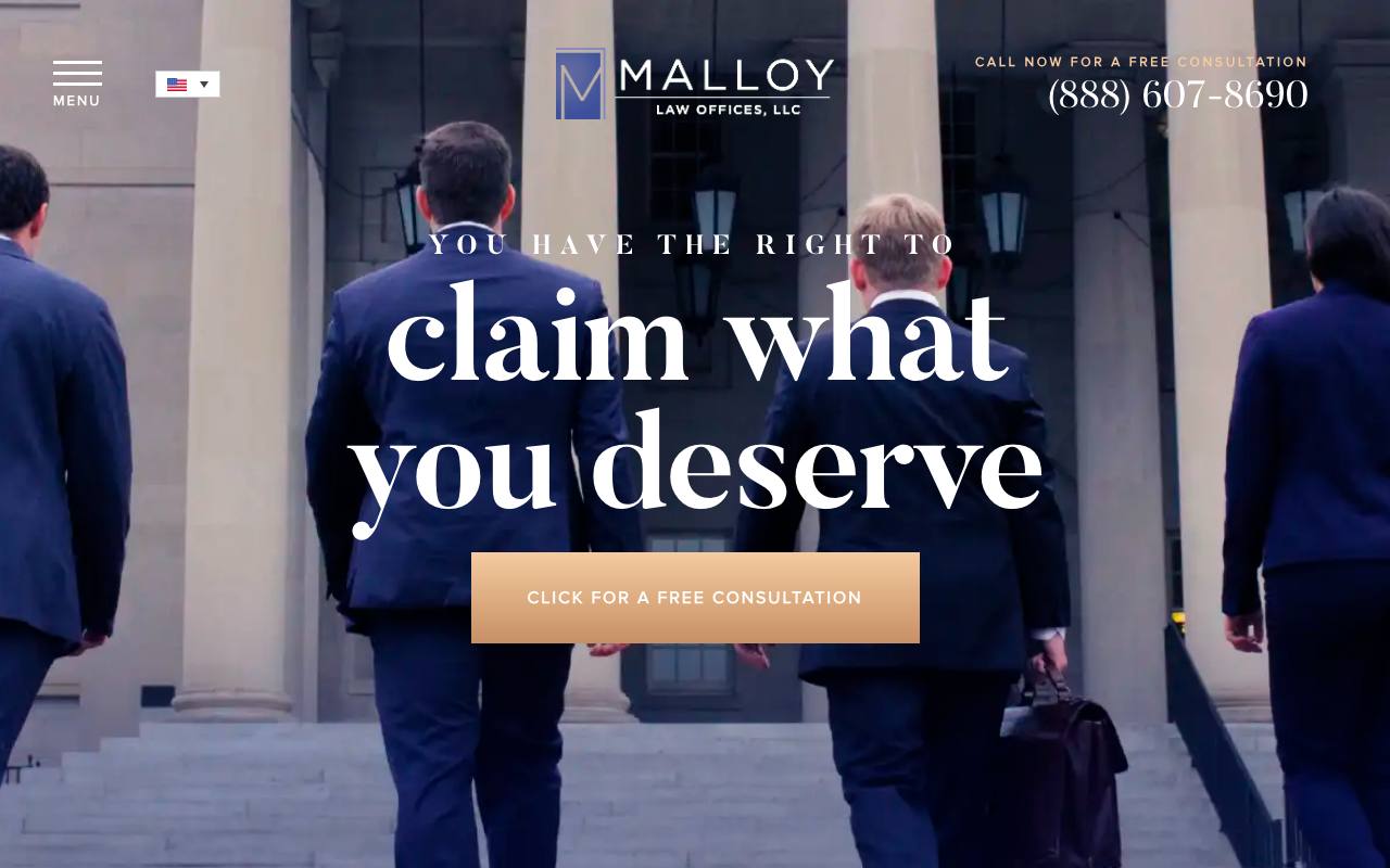
Malloy’s homepage looks distinctive without becoming confusing. The restrained navy-and-gold palette, courthouse imagery, and centered logo create a premium legal brand. More importantly, the headline—“You have the right to claim what you deserve”—connects that style to a client’s situation, and the free-consultation button gives the page a clear purpose.
The phone number is visible in the first screen, so someone who is ready to speak with an attorney does not have to open a menu. Deeper in the site, attorney credentials, office details, reviews, and consultation options support the initial promise. This combination earned Malloy full marks in our trust and intake checks.
The page is not perfect. Large hero media can slow down the first view on a phone, and the promise would be even stronger with a short line naming the firm’s core personal-injury cases. Still, the overall journey is focused and credible.
Best idea to borrow: Use one memorable message, one dominant consultation button, and one visible phone number. Avoid stacking several equally loud offers.
Audit snapshot (August 26, 2026): Lab mobile performance 89/100. Routeless scores: search setup 100/100, trust 100/100, consultation paths 100/100, AI readability 100/100. 588 referring websites (Ahrefs).
2. Sahn Law Firm — immediate practice-area and location clarity
Official site: sahnlaw.com
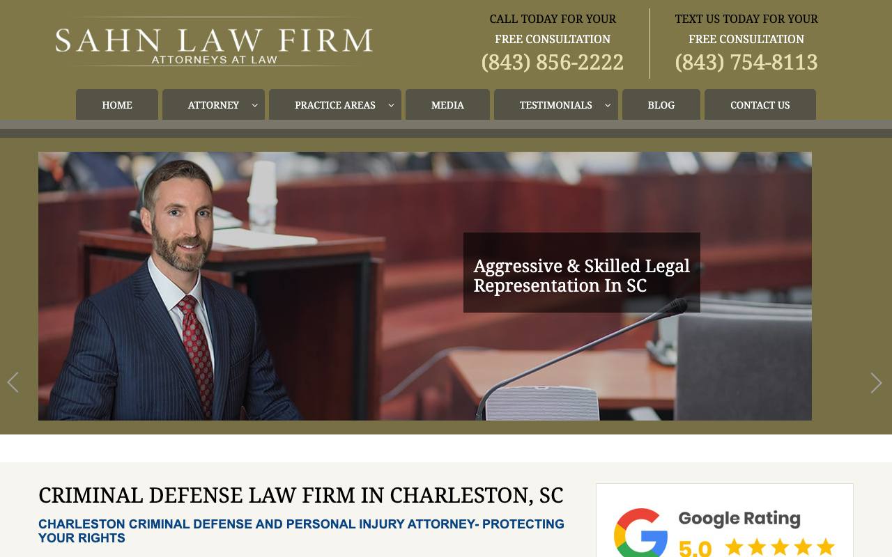
Sahn Law Firm takes a more traditional visual approach, but the page is unusually direct. The header provides separate call and text numbers for a free consultation. The hero then identifies the attorney and states “Aggressive & Skilled Legal Representation in SC,” followed immediately by “Criminal Defense Law Firm in Charleston, SC.”
That specificity is valuable. A person facing a DUI or criminal charge can confirm the service and jurisdiction in seconds. The page also places testimonials, attorney information, contact options, and a Google rating along the natural path toward consultation. The result is a site that feels built around urgent client questions rather than around the firm’s biography.
Traditional styling will not suit every brand, and the navigation could be simplified. But Sahn demonstrates that clear information and credible proof can matter more than a trendy layout.
Best idea to borrow: Put the practice area and geographic market in visible page copy, not only in the browser title or footer.
Audit snapshot (August 26, 2026): Lab mobile performance 94/100. Routeless scores: search setup 100/100, trust 100/100, consultation paths 100/100, AI readability 100/100. 484 referring websites (Ahrefs).
3. HagEstad Law Group — modern design for a multi-state practice
Official site: hagestadlaw.com
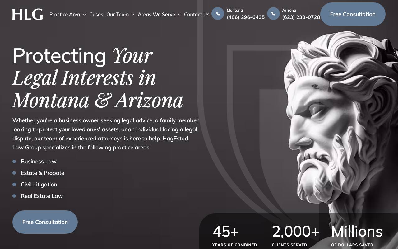
HagEstad pairs a modern, restrained design with unusually useful homepage copy. The opening statement names Montana and Arizona, while the supporting paragraph and service list identify business law, estate and probate, civil litigation, and real estate law. Separate phone numbers for each state remove ambiguity for a multi-market firm.
The large sculpture image gives the page a recognizable visual identity without competing with the text. A single “Free Consultation” button is repeated in the header and hero. Below it, experience and client-count figures add quick proof, while the rest of the site provides attorney, case, and service-area detail.
The main improvement would be to connect the broad service list to clearer visitor paths. A business owner and a family planning an estate have different concerns, so each should be able to reach the right explanation quickly.
Best idea to borrow: Multi-office firms should route visitors by state or market before presenting a generic contact form.
Audit snapshot (August 26, 2026): Lab mobile performance 95/100. Routeless scores: search setup 100/100, trust 100/100, consultation paths 75/100, AI readability 100/100. 794 referring websites (Ahrefs).
Design examples for other kinds of firms (reviewed October 10, 2026)
The three winners are an injury firm, a criminal-defense firm, and a multi-practice firm. These four show ideas they don't: a small firm built around its founder, a boutique that does one thing, a modern brand, and a minimal type-led page. They are not ranked, and only Collins Law went through the benchmark. Each review comes from the live homepage at desktop width and on a 390-pixel-wide phone on October 10, 2026.
Collins Law — a founder-led injury firm that puts the call first
Official site: acollinslaw.com · Practice focus: personal injury, Birmingham, Alabama · Small, founder-led firm
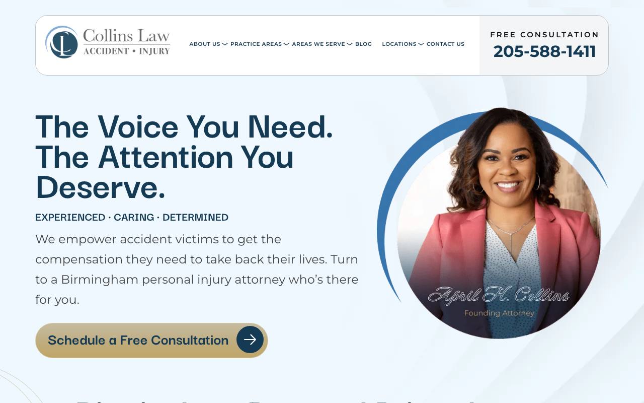
- Strength: The founding attorney, April H. Collins, is named and pictured in the first screen, so a visitor knows who they would be speaking with before they scroll.
- Strength: The header pairs “Free consultation” with the phone number. On a phone that becomes a full-width “Tap To Call 205-588-1411” bar directly under the logo.
- Limitation: The large headline—“The Voice You Need. The Attention You Deserve.”—could belong to any firm. The practice and city appear only in the smaller paragraph beneath it.
- Idea to borrow: On phones, make the call button a full-width bar under the logo rather than an icon inside the menu.
Collins Law also passed every requirement of the August benchmark; it was one of the qualified sites that did not score in the top three.
Gerben IP — a boutique that names its one service in the button
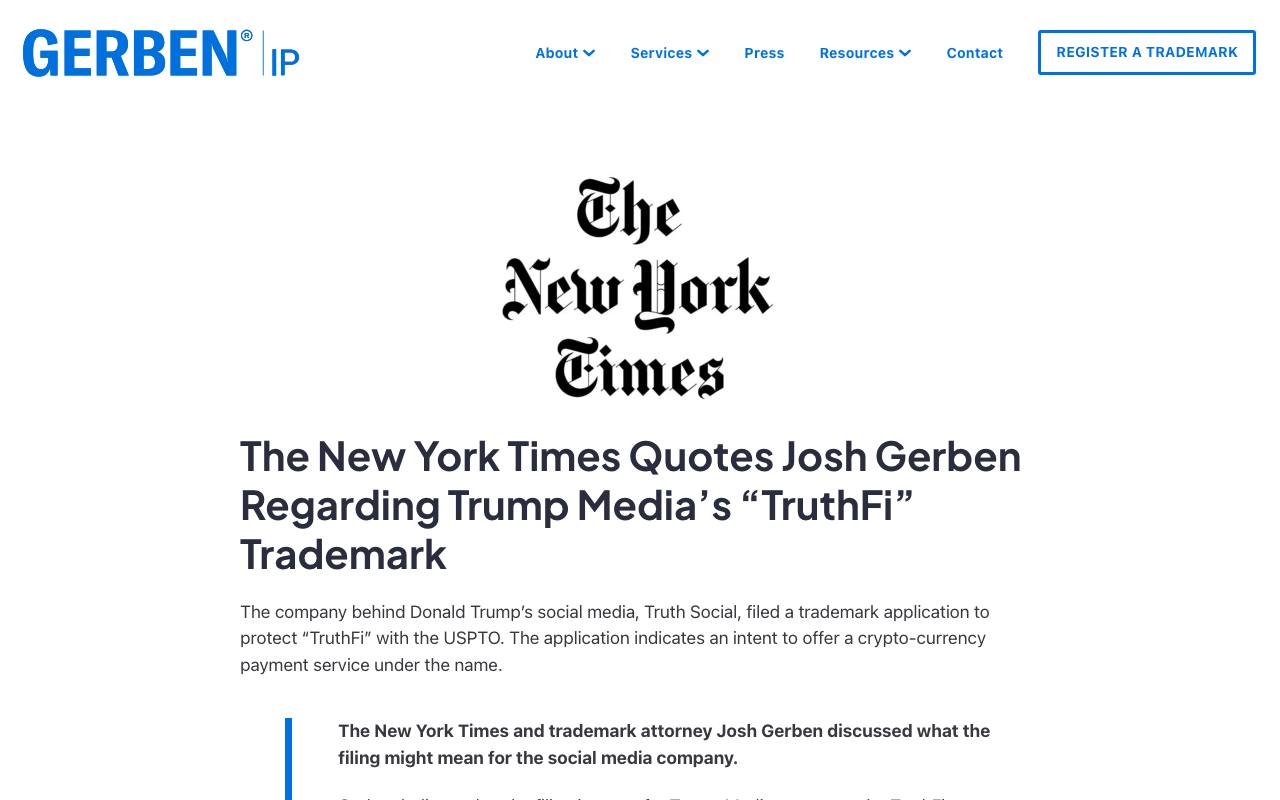
Official site: gerbenlaw.com · Practice focus: trademark law, nationwide · Single-practice boutique
- Strength: “We protect brands,” followed by “Our trademark attorneys create and execute… brand protection strategies,” tells a visitor the whole practice in two lines.
- Strength: The desktop header's main button is the service itself—“Register a trademark”—not a generic “Contact us,” and the hero shows trademark registration certificates instead of stock courtroom imagery.
- Limitation: Neither screen shows a phone number. On a phone, the first screen offers “Meet the team” and “Contact us” but no tap-to-call link.
- Idea to borrow: Name the main button after the job the client came to do.
Modern Family Law — a modern identity that says who it serves
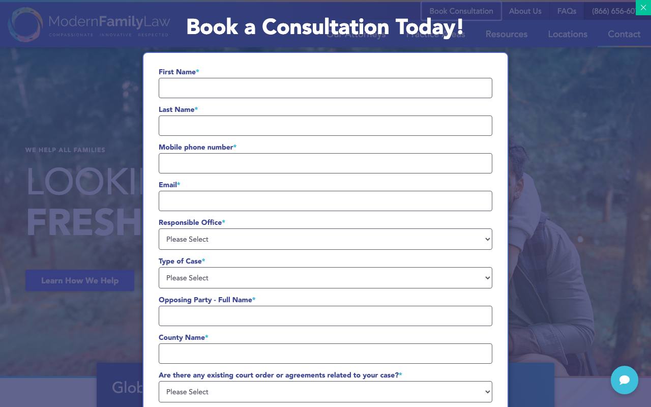
Official site: modernfamilylaw.com · Practice focus: divorce and family law · Modern brand identity
- Strength: The identity is distinct for a law firm—a multicolored ring logo, a gradient rule, and the tagline “Compassionate · Innovative · Respected”—and the copy below the hero lists the families it serves: “divorced parents, single-parent families, same-sex parents, grandparents as parents.”
- Strength: On desktop, a utility bar keeps “Book Consultation” and the phone number above the main navigation, separate from the practice-area links.
- Limitation: On a phone, the first screen shows “Looking for a fresh start” and “Learn How We Help” but no phone link or consultation button, and the headline doesn't say family law.
- Idea to borrow: Right under the hero, name the family situations you handle so a visitor can recognize their own.
Susman Godfrey — a minimal, type-led first screen
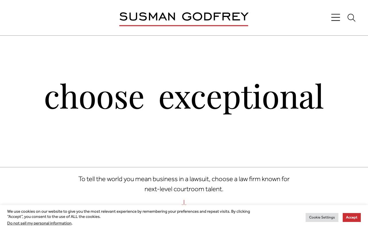
Official site: susmangodfrey.com · Practice focus: trial litigation · Minimal, type-led design
- Strength: One two-word statement in large serif type, generous white space, and a single supporting sentence: “To tell the world you mean business in a lawsuit, choose a law firm known for next-level courtroom talent.”
- Strength: Nothing competes with that message—no badges, chat window, or stacked offers in the first screen.
- Limitation: There is no contact path in the first screen. The navigation sits behind a menu icon even on desktop, we found no visible phone link anywhere on the homepage, and its H1 had no readable text when we checked.
- Idea to borrow: If you strip a page down, keep one sentence that names the client's situation; that sentence is what makes a minimal page specific.
Law firm website ideas worth copying
Write for a worried client, not another lawyer
Lead with the situation a person is facing, the type of matter the firm handles, and the jurisdiction. Explain legal concepts in ordinary language. Dense copy filled with case citations may demonstrate knowledge, but it rarely helps someone decide whether to call.
Show attorneys as people and professionals
Include real attorney photography, relevant licenses, experience, and a short explanation of how the firm works with clients. Awards can help, but they should support—not replace—clear credentials and specific experience.
Put proof beside the consultation path
A “Free Consultation” button creates questions: Who will respond? Is the conversation confidential? Does the firm handle this type of case? Reviews, results, attorney details, and a short expectation-setting sentence can answer those objections near the point of action.
Separate practice areas thoughtfully
Each main practice area deserves a useful page that explains common situations, who the firm serves, what differentiates its approach, and what someone should do next. This improves the visitor experience and gives search engines a clear page to match with a specific legal question.
Treat mobile contact as the primary experience
Many legal searches happen during stressful moments on a phone. Keep the phone number tappable, forms short, type readable, and chat widgets out of the way. A website should not cover its own content with several competing intake tools.
A practical law firm homepage structure
- Header: firm name, primary phone number, location or service area, and consultation button.
- Hero: specific practice focus, market, short client-centered promise, and one action.
- Immediate proof: review rating, meaningful experience, or another verifiable result.
- Practice areas: clear paths based on the problems clients actually search for.
- Attorney introduction: names, real photographs, credentials, and links to full profiles.
- How the firm helps: a plain-language explanation of the process and what happens after contact.
- Results and testimonials: ethically presented evidence with appropriate disclaimers.
- Contact and office details: phone, short form, address, hours, and response expectations.
Our law firm SEO guide explains how those pages support organic search. If you are budgeting a redesign, the law firm website cost guide covers realistic ranges and tradeoffs.
How we chose these examples
We started with the latest Routeless benchmark and performed fresh checks on August 26, 2026. Every winner had to represent an operating firm, work securely on mobile, remain available to search engines, provide attorney and office trust signals, and offer a practical consultation path. We also checked whether other websites link to the domain and whether search and AI systems can understand its content.
The published minimums were 70 for mobile performance, 75 for SEO, 60 for trust, 50 for conversion, and 95 for AI readiness. Each winner also needed structured data, a sitemap, a valid /llms.txt, a Domain Rating of at least 10, and at least 50 referring domains. Domain Rating, referring domains, and /llms.txt were recorded as context for the review, not as evidence that any of them causes rankings or AI recommendations.
The technical score was only the first gate. We excluded sites whose live first screen was empty, obscured, or centered on unrelated content. That visual review is why the final examples may differ from a purely numeric ranking.
The design examples were chosen differently. We looked for firm types the winners don't represent, captured each live homepage on October 10, 2026 at 1280 pixels wide, and opened it on a 390-pixel-wide phone to record what the first screen offers and whether it has a tap-to-call link. They weren't scored, so they can't be compared to the winners on speed or authority, and a place in this guide is not an endorsement.
Frequently asked questions
What makes a law firm website eligible?
It must be a real operating firm, work well on mobile, clearly identify its lawyers and services, offer a usable consultation path, and pass our search and authority checks. A recognizable name or expensive design does not create an exception.
Why are only three of the examples ranked?
Eighteen law firm websites passed every benchmark requirement in August, and we publish the three highest scores rather than a long list of near-identical results. The four design examples cover firm types the winners don't—a small founder-led firm, a boutique, a modern brand, and a minimal design—and are labeled separately because they weren't scored.
What pages should a law firm website include?
Most firms need a clear homepage, useful pages for each primary practice area, attorney profiles, results or representative matters where ethically permitted, testimonials, office and contact information, privacy information, and educational answers to common client questions.
Should law firms use live chat?
Chat can help when it is staffed, secure, and easy to dismiss. It hurts the experience when it covers the headline, launches before a visitor understands the firm, or competes with several other contact tools.
How long do these results remain valid?
The benchmark is due for a recheck 120 days after it runs, and each recheck recaptures the homepages and confirms the winner set. If a recheck is late, this page says so and dates the results instead of presenting them as current.
Law firm websites built with Go
These demo websites came out of Routeless Go, which builds three designs from your business details and publishes the one you choose for $99 a month.

Delgado Injury Law
Personal injury law firm website in the classic and refined design.
Open the demo ↗Author: Eric Provencio · Reviewed: October 10, 2026